An exclusive RIPPER STREET interview
with titles designer Nic Benns
Interview copyright © Damian Michael Barcroft 2017
Images copyright © Nic Benns/Momoco
~
DAMIAN: The television titles forever seared into my childhood memory are Doctor Who (from the early Tom Baker era) and those ridiculously scary naked ladies dancing in flames from Tales of the Unexpected. And, of course in cinema, the James Bond credits -particularly the early ones by Maurice Binder- and Saul Bass’ work for Hitchcock always remain vivid in my mind. What titles have had an impact on you over the years?
NIC: Tales of the Unexpected was the first title sequence that really made an impression – it was very scary. The hypnotic movement of the dancers, the skulls but also the music. The opening to Seconds by Saul Bass was powerful because of an effect he created with a flexible mirror. The refraction of a face was eerie and at one point he organically splits an eye like a cell – entirely in camera, a very simple set up, timeless.
DAMIAN: Looking back on some of these that were made for television, it’s often the case that it’s not the stories or even characters that people remember, but rather isn’t it the titles and the music?
NIC: The music was often very strong melodically and it’s a simple tune with a stark concept for the titles that make an impression. The graphic nature of the sequences on a rostrum with hard editing convey a lot of confidence with limiting technology.
DAMIAN: I think that television during the sixties and seventies had some really stylish and elegant specially filmed title sequences such as The Prisoner, The Avengers and The Persuaders but then elaborate designs such as these seem to have been discarded in favour of just having clips and montages of the show during the titles. Why do you think this was the case and why have title designs such as the ones you create found favour once more?
NIC: Maybe because there wasn’t the marketing structure, there weren’t the trailer campaigns with social support. Titles had to work harder to convey the mood, the action of the show, introduce the characters, set up the story. A thirty-second burst of action scenes sets up a lot of promise and is its own mini teaser.
We sometimes feature characters from the show but we re-contextulise them so they’re not repeated. We also shoot the actors when we can, so its entirely bespoke to our storytelling. Shooting allows us to create compositions to accommodate the type.
DAMIAN: There are some title sequences which are wonderful to see once such as Michael C. Hall in Dexter getting up in the morning, dressing and preparing breakfast which is juxtaposed with various imagery evoking methods in which a serial killer might dispatch his prey. However, after watching this two-minute title sequence for twelve episodes per season, it all gets a little bit tedious. What would you consider to be the right balance between great visuals that tell a story and are almost a mini movie in themselves and simply becoming tiresome?
NIC: A story can be told in twenty seconds or less. The mood conveyed with a five second title like a branding sting also works.
If the titles are a prologue that saves the director having to explain it later then it can be a longer sequence.
From our archive: Humans, The Gunman, Father & Son set up a backstory/history to bring the audience up to speed or strengthen a particular character within the story.
There’s been discussions that the first episode could be a longer titles cut than the rest of the series.
DAMIAN: There are many different kinds of title sequences: the plain black and white credits such as those that open every Woody Allen film which are dull no matter how much one enjoys jazz, the same simple style of credits which work and are effective because they are intercut with opening scenes or vignettes like Endeavour, credits over the action that form part of the story such as some of the best animated Disney films, the specially designed sequences that are almost a meditation on the themes or ideas of a production,Tim Burton’s Edward Scissorhands or Ed Wood spring to mind, the ones where the information contained therein serves as a prologue to the series such as Homeland and also titles that, it could be argued, offer an almost psychological perspective of one of the main characters such as Sherlock with its tilt-shifting camera technique forcing us to look at the London cityscape as he does. Would you agree that a dull title sequence is both a missed artistic opportunity and a complete waste of valuable screen time?
NIC: A dull title sequence can also be a breathing point after a frenetic opening act and ‘previously montage’.
DAMIAN: So what exactly makes a good title sequence?
NIC: A good title sequence is a doorway into the film – like a good book cover illustration, it sets the tone and references a moment or collective themes within the story that are revealed as you travel through the narrative.
A good title is also a single memorable concept that engages and invites the audience to go “Ah! I get it!” when watching the show and making that connection.
DAMIAN: Do you sometimes find yourself creatively restricted due to the fact that cast and crew presumably have to be billed in a certain order and does this ever limit what you are able to achieve artistically?
NIC: This has happened a few times. On Dracula we had to run a character/actor order which meant compromising the storyline of our titles.
 It’s happened on The Musketeers too but the sequence is just a lot of fun and sweeps the audience through, its more a mood and character intro.
DAMIAN: Although it’s not the case with Ripper Street but rather more with reference to US television, are executive producers sometimes the enemy of creative titles?
NIC: There have been cases when there are too many conflicting voices that can cause compromise in order to please everybody but the Producer and Director usually focuses and distills.
DAMIAN: Can you tell me about how you became a titles designer in the first place and also a little bit about the genesis of your studio Momoco?
NIC: I was going to be a comic book artist but studied animation at California Institute of the Arts. When I saw Imaginary Forces work, especially The Island of Doctor Moreau I was astounded that credits – a film within a film – can be so mesmerising and combine great editing, animation, graphic design and music. I started the studio with designer, Miki Kato and set up Momoco in 2000 where we’ve been producing film and TV titles and commercials for seventeen years now. We’ve been fortunate to collaborate with directors like Richard Curtis, Stephen Daldry, Lasse Halstrom, Kevin Spacey, Dustin Hoffman and Ridley Scott.
DAMIAN: What does the name Momoco actually mean?
NIC: Peach
DAMIAN: I discussed the Guy Ritchie Sherlock Holmes films in my interview with composer Dominik Scherrer and he told me that the signature style of Hans Zimmer’s score formed a part of a portfolio of many inspirations regarding his music for Ripper Street. Your title design for the show is quite reminiscent of the end credits from those two films so I’m wondering if they were also referenced in conversations with you?
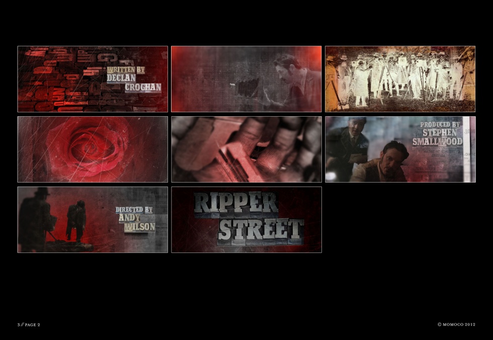
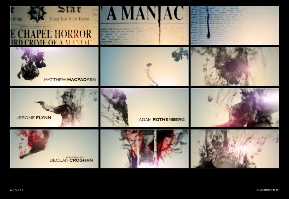
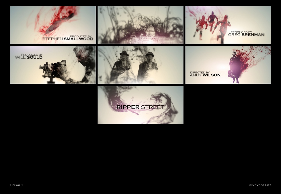
NIC: Sherlock Holmes was calligraphy and watercolour ink bleeds which we avoided for Ripper Street.
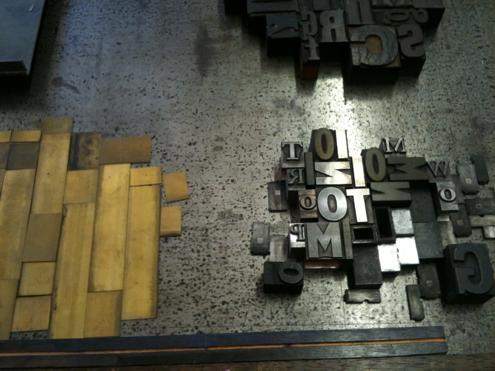
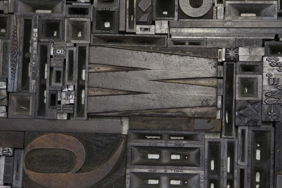
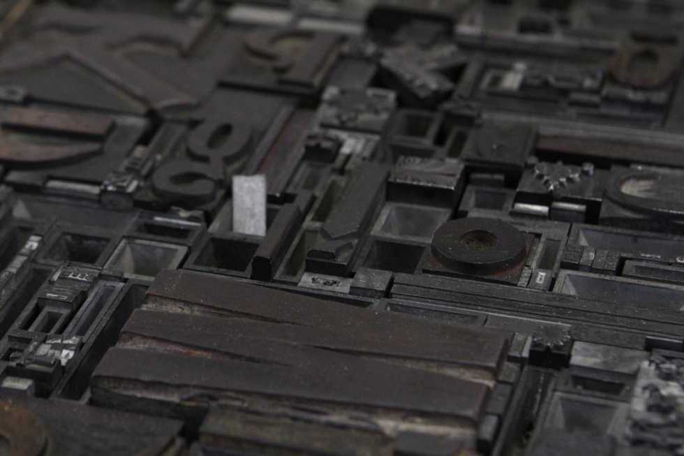
Ink Mattes (bringing images on with ink dispersing on litmus) was a bit of a trend at the time. We started using the technique in 2008 on Father & Son. Ripper Street may have the vibe of Holmes but is lead letterpress. The concept is that it’s the birth of the tabloid so we used letterpress, having all the images formed from type.
 DAMIAN: Many of the publicity stills and marketing images, particularly from the first series, evoke your designs. Did they base these brandings on your designs or was it the other way round?
NIC: We made the posters and billboards for series 2, 3 and 4 and supplied a galley of textures and letterpress elements for series 1.
DAMIAN: Can you describe your first thoughts and reaction to the title of Ripper Street – what images were formed in your mind?
NIC: Gore!
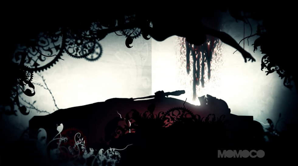
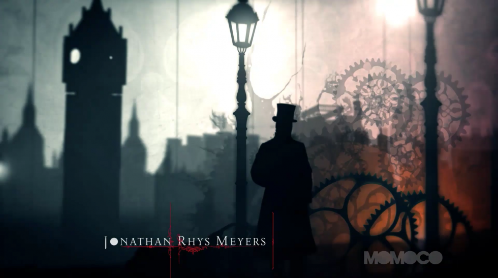
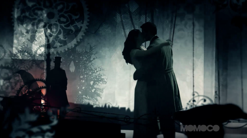
![]()
Early logo concept designs
DAMIAN: And tell me about your initial ideas regarding an identity for Ripper Street.
NIC: We went through a lot of ideas, starting with the obvious knife but when the titles concept was chosen there was only one real route with the lead type.
DAMIAN: Can you take me through the process of designing the titles for Ripper Street including the conceptual development, development after the pitch and preparing for the shoot?
NIC: After storyboarding, we made an animatic for the composer to work to. Using After Effects we drafted out the camera moves and used stock text as placeholders for our shoot.

Unused concept boards
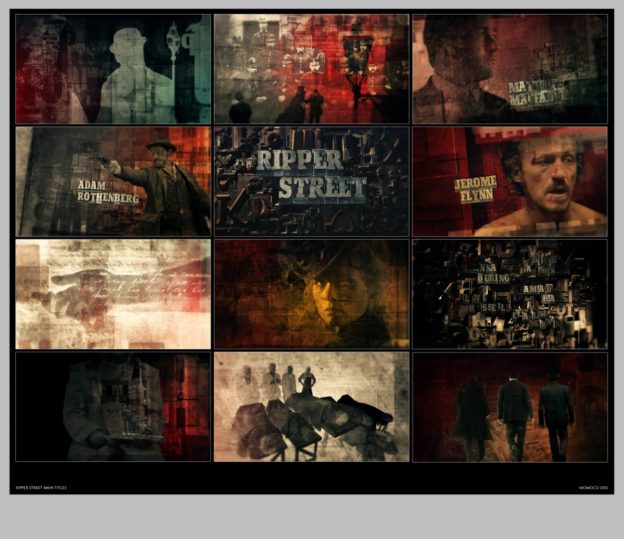
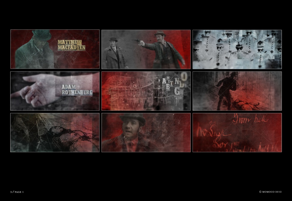
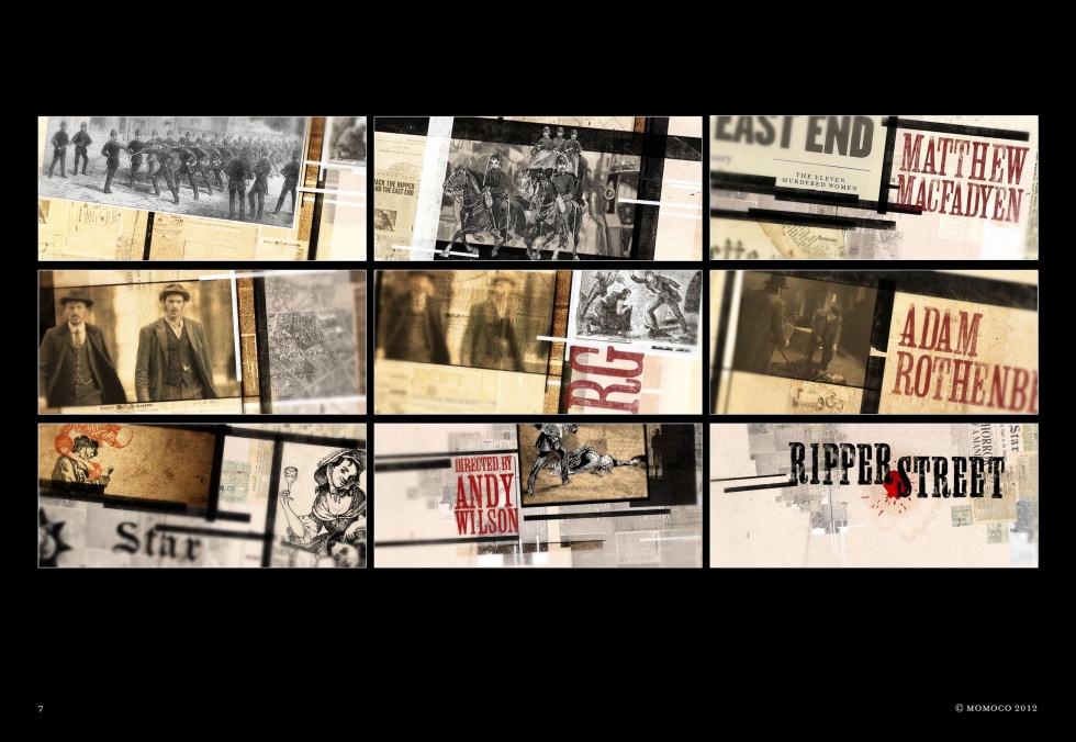
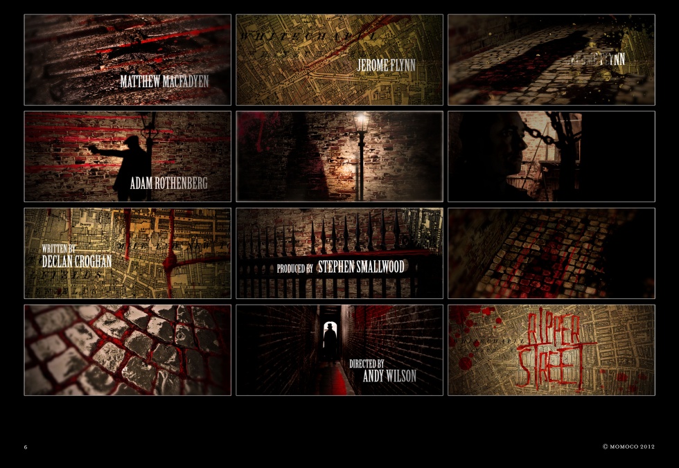
DAMIAN: And can you describe your choice of images and presentation such as the printer’s block type, the subdued sepia palette and poverty maps for example?
NIC: We went through the show and grabbed stills that were strong and character iconic. The red and metal and gold was a tight pallette, we didn’t want it to be entirely sepia though there is a nod to the early press photography. The type was based around Caslon and Clarendon which was popular at the time. I think we were doing Peaky Blinders that same month and used printed Clarendon for that.
DAMIAN: Jack the Ripper heralded the birth of sensationalist tabloid journalism in many respects so I wonder if the typography of the titles, the logo and many press pieces was a conscious decision to reflect this?
NIC: Yes, we produced a few ideas based on newsprint and print presses.
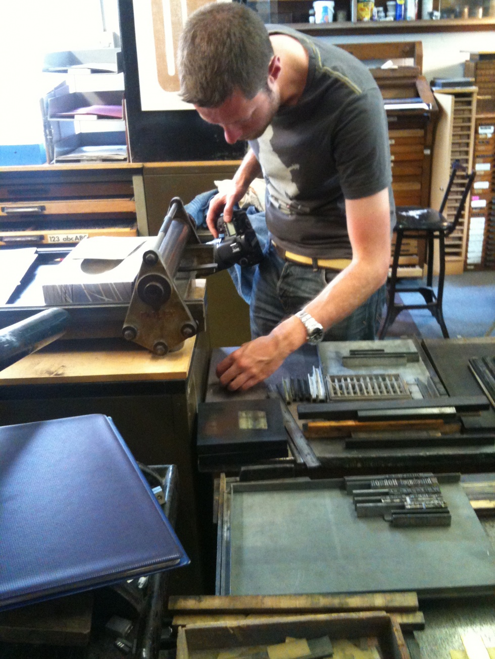
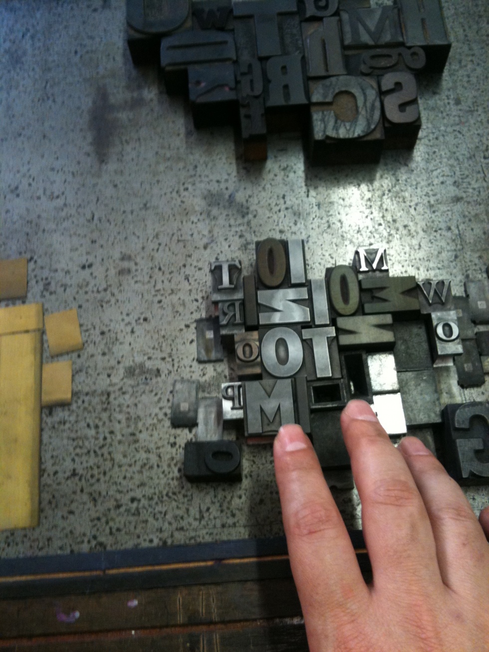
 DAMIAN: How did you actually create the texture of the images that we see?
NIC: We went to a traditional east end letterpress workshop/museum and made lots of compositions with the type. We then filmed as much as we could using them as real textures for our CG elements. We also filmed dust to embed it all. I animated and edited most of the first edit on a rooftop in Thessaloniki, Greece while supposedly on holiday!

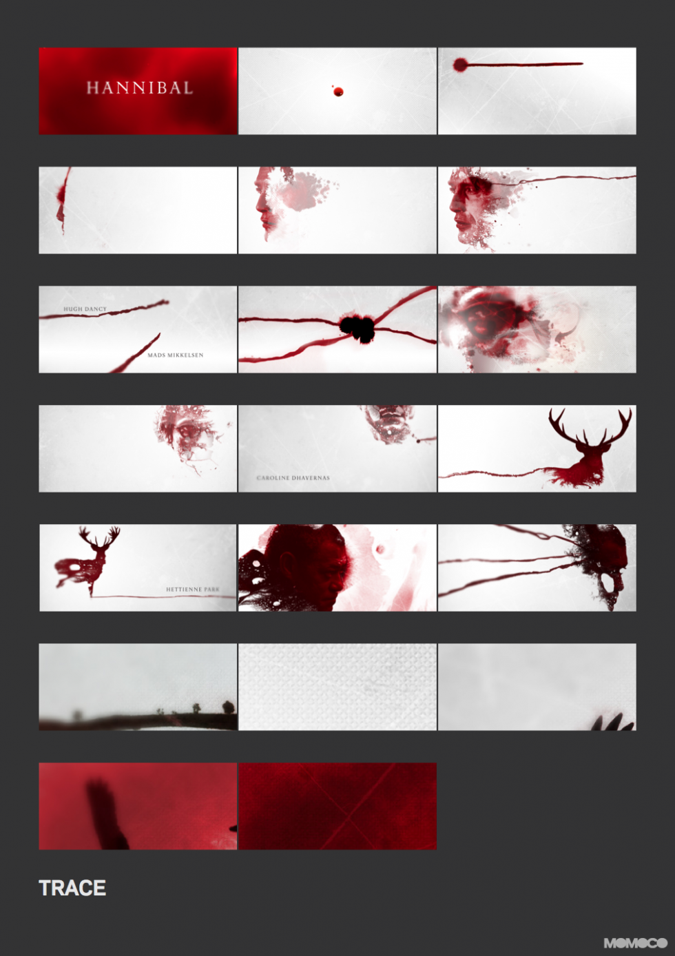
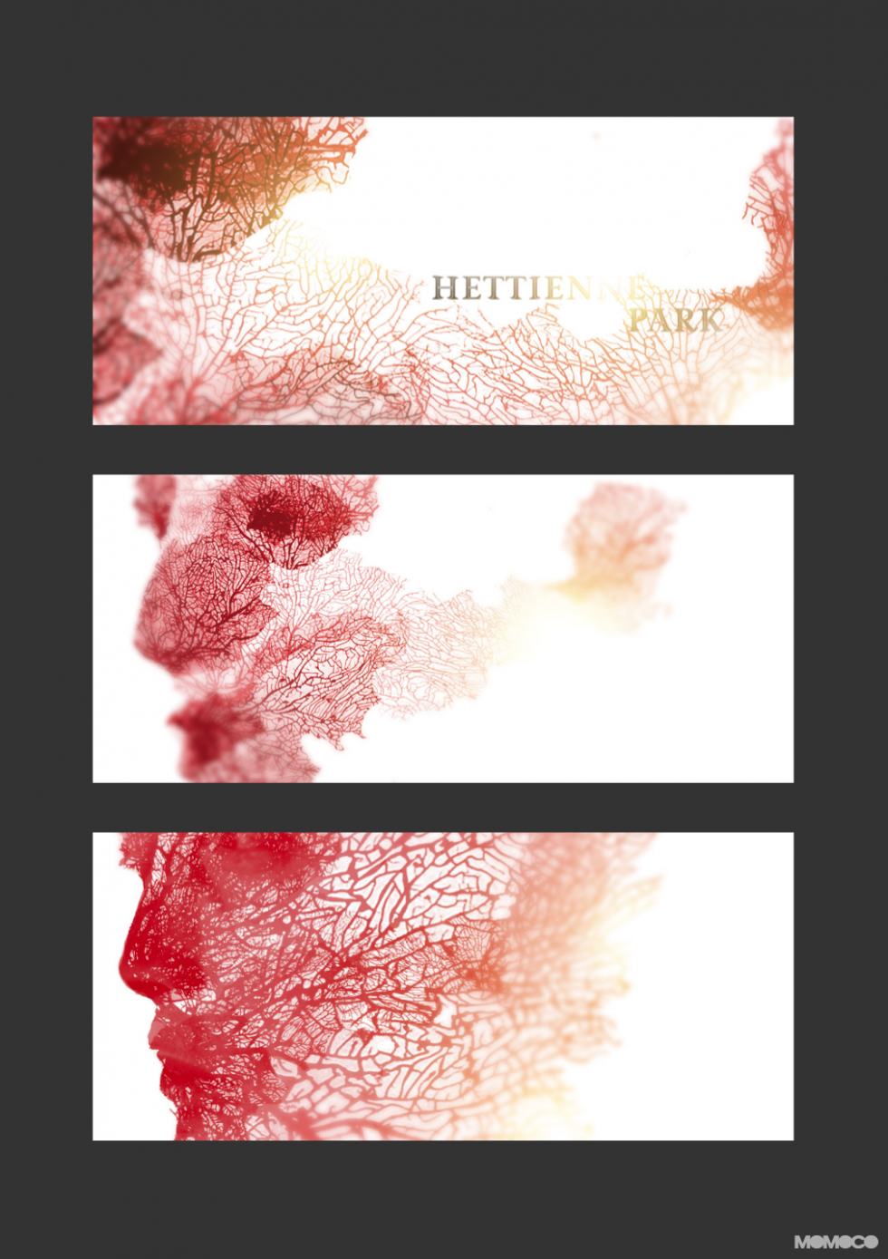
 DAMIAN: Now, I must also ask about Hannibal as it’s one of my all-time favourite shows. Obviously everyone is familiar with the character but were you a fan of The Silence of the Lambs and the other books or films?
NIC: Yes I thought the films were very strong.
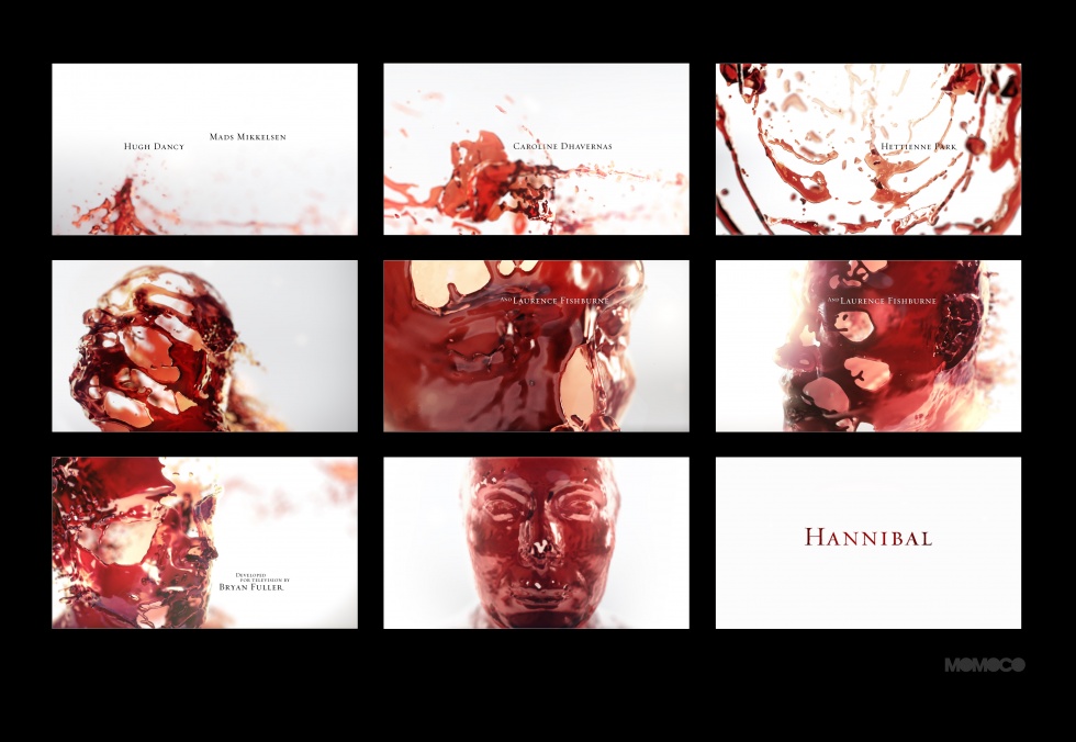 DAMIAN: Dr. Hannibal Lecter is a complex character. What does your title sequence say about him?
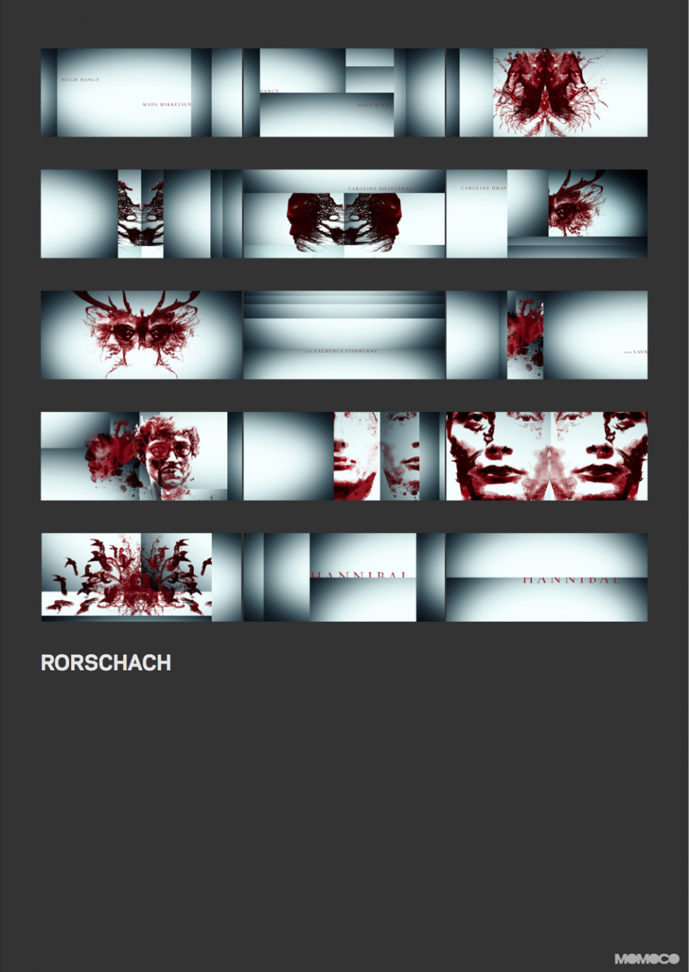
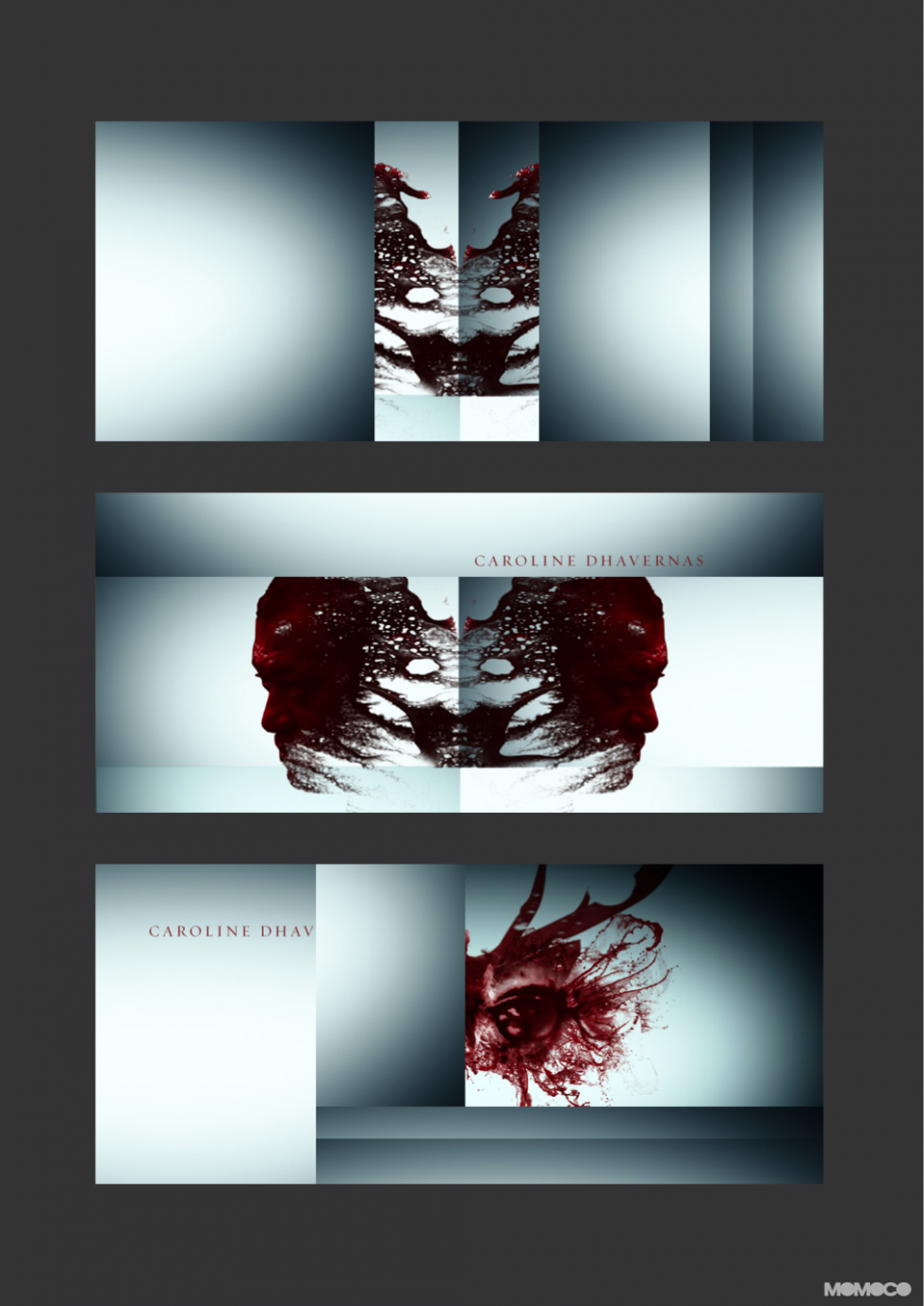
NIC: Well it’s a very restrained sequence, some of the early concepts tapped the psychological especially with the Rorschach idea.
 DAMIAN: To what extent do you also try to get inside the head of Will Graham and Jack Crawford?
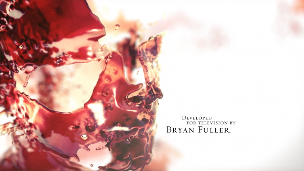
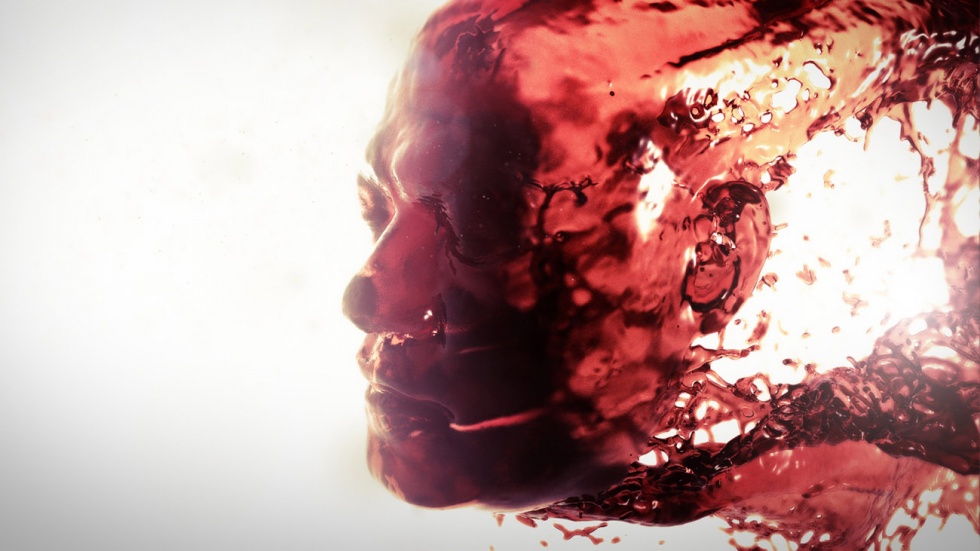
NIC: In the wine/blood animation we looked at having Will’s head grow from his eyes, because that is his special power – tracing psychological events.
 DAMIAN: Were there any alternative ideas or concepts from the design that was chosen, and if so, why were they discarded in favour of what we eventually saw onscreen?
NIC: I explored the idea of the chase – streams pursuing each other, forming images along the way as they collide but the director had an idea that he wanted to feature details of the characters.
 DAMIAN: What is your favourite title sequence or which one are you most proud of?
NIC: Our favourite titles are Luther (the mood) and Hard Candy (the concept that you get after watching the film), Great Expectations (beautiful sequence that won us an Emmy) and Fortitude (haunting opening that bagged a BAFTA)
We’re often happy with titles that go out of the door with minimal changes.
DAMIAN: Nic, thank you very much indeed.
NIC: Cheers!
Nic Benns
~~~
Interview copyright © Damian Michael Barcroft 2017
All the interviews and articles on this website are original and exclusive and I would ask that the copyright be respected. Therefore, please do not use quotes or any other information contained here without permission. Thank you.
~