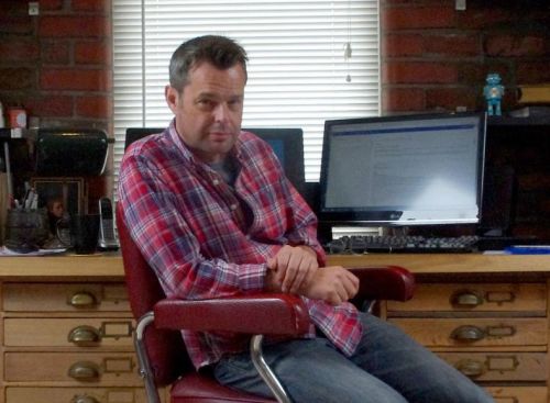
Interview copyright © Damian Michael Barcroft 2021
All images by Gavin Lines copyright © 2000
Endeavour copyright © Mammoth Screen ©2000/21
DAMIAN: What images do you have hanging on your office wall to inspire you?
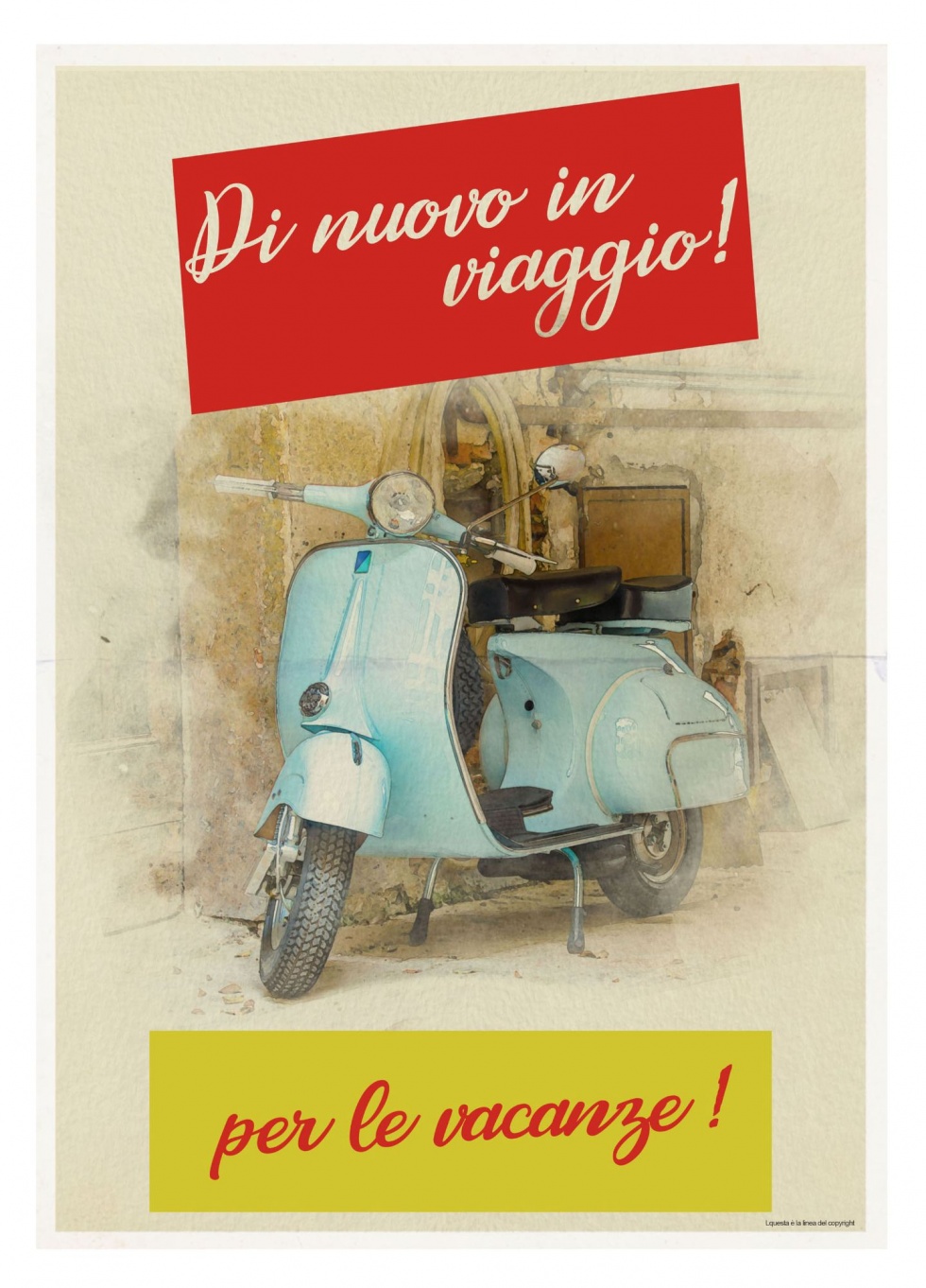
GAVIN: I certainly have a taste for graphic design of the 1950s and ’60s. I have a number of posters and prints from this era – railway and holiday posters on the wall, as well as some product adverts. Along with some artefacts as well, I have an old chocolate vending machine that would have been seen on station platforms, which is my pride and joy.
DAMIAN: How old were you when someone first noticed your talent for art?
GAVIN: Well, I’ve always drawn – growing up, my parents would have said that a pencil and paper would be the easiest way to keep me quiet. I think my first recognition would have been a poster I did for the school library in middle school at about age 10, that won me a book token for my efforts.
DAMIAN: What sort of things did you enjoy drawing as a child and in your teenage years?
GAVIN: All kinds of things really, I enjoyed drawing comic strips. In my teenage years, I was able to experiment with my brother’s home computer to create illustrations digitally for the first time, some quite elaborate images which were created in a basic 4 colour 8-bit style. This early introduction to digital art really helped me grow in confidence using computers and it’s seen me well over the years.
DAMIAN: At what point did you seriously start to consider pursuing a career as an artist?
GAVIN: In my late teens and early 20s I worked in archaeology. Drawing plans and elevations of site features. This was my career for a number of years, but I would often catch myself sketching the landscapes and people in the margins of the plans. So I enrolled at art school and studied graphic design and animation at university in Bristol and never looked back.
DAMIAN: You’ve worked in illustration, print and promotion, animation, as well as live action film and television projects. What was the first piece of graphic design or illustration that you were paid for as a professional?
GAVIN: After graduating from UWE in Bristol, I moved to London looking for work in animation, it was whilst I was there that I had the opportunity to submit drawings as a pitch to be illustrator for Bob the Builder books and magazines. It was this which afforded me the chance to again create art digitally. Over the years I illustrated a number of books for BBC Children’s publishing as well as some for Random House and others as well as illustrations for children’s magazines.
DAMIAN: For a layman such as myself, can you explain what it is you do in film and television and what the difference might be between a graphic artist and graphic designer?
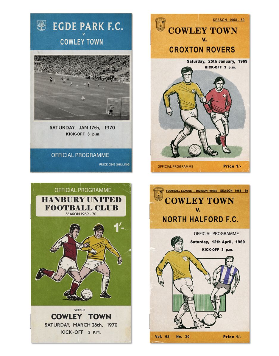
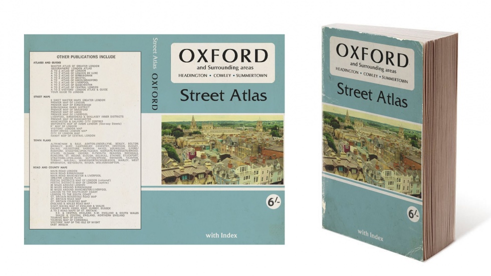
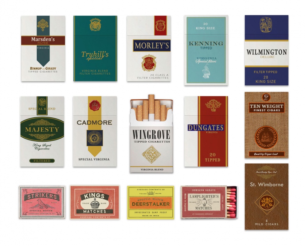
GAVIN: Graphic designers for film and TV, are tasked with creating the print and often digital elements needed for a show. That can range from newspapers, books, magazines, posters, any letters or paperwork needed. It can also be maps, photographs, product packaging, signage and many other requirements including screen graphics. We can also be required to generate paintings and artwork and I’ve created patterned wallpaper and carpets. If I’m being credited as a graphic artist it’s usually because more illustration has been required in the role.
DAMIAN: Wallace & Gromit, Shaun the Sheep, Creature Comforts, Early Man, The Pirates, and Flushed Away; would you say that your skills are particularly well-suited to animation or do you have a strong working relationship with Aardman?
GAVIN: Each project presents its own challenges, working in animation I get to do more illustration and I do get to employ my funny bone. But the role of graphic designer on any show is much the same, it’s the show which sets the style and I approach each project individually. I’ve worked with Aardman for over twenty years now, on many varied projects and I have a talent for humour which is well suited.
DAMIAN: I’m not suggesting it’s necessarily a case of either or but is your priority as a graphic artist to make the objects authentic for the actors to react to as a stimulus on set while filming – including, of course, our plasticine friends – or the audience watching at home who perhaps won’t even appreciate that all the items you mentioned need to be designed and then actually made?
GAVIN: A lot of the graphics the audience shouldn’t give a second thought, the work shouldn’t stand out, it’s part of the immersion of the show. I do hope the actors find the graphics helpful in a scene, many letters and documents which have been created, won’t even be seen by the audience, but if they can help performance in any way, then they have been very successful. Some of the work is for hero props and to be featured prominently, then it’s nice to think that people notice. In animation projects, everything is created from scratch, so I try to make it all funny where I can, if it gets a laugh, when that’s very rewarding.
DAMIAN: Your work for live action television includes such hits as Broadchurch, Poldark and, of course, Endeavour. To what extent do you think that potential clients looking at your portfolio or website ( gavinlines.com ) might be more impressed – and thus obviously more likely to commission you – with the prestigious projects you’ve previously worked on as opposed to the actual merits of the graphics themselves?
GAVIN: A production designer needs to know you can do the work, on time and in budget, work examples and experience shows that you can do that. I think both in equal measure would get the job. I could come up with designs, but without experience on a show, a producer or designer wouldn’t know if you could perform when needed.
DAMIAN: How did you get the job on Endeavour?
GAVIN: Madelaine Leech – production designer – and I have mutual friends and she got in contact through a recommendation. We hit it off straight away and it’s been amazing working with her on a number of shows, she’s a source of constant support and inspiration.
DAMIAN: Can you remember the first piece of graphic design you did on Endeavour and which episode it appeared in?
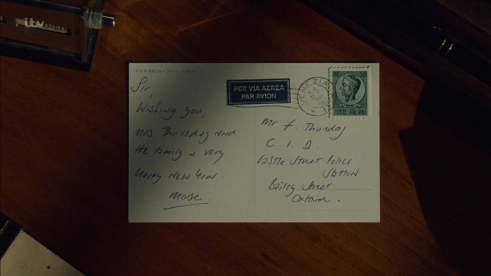
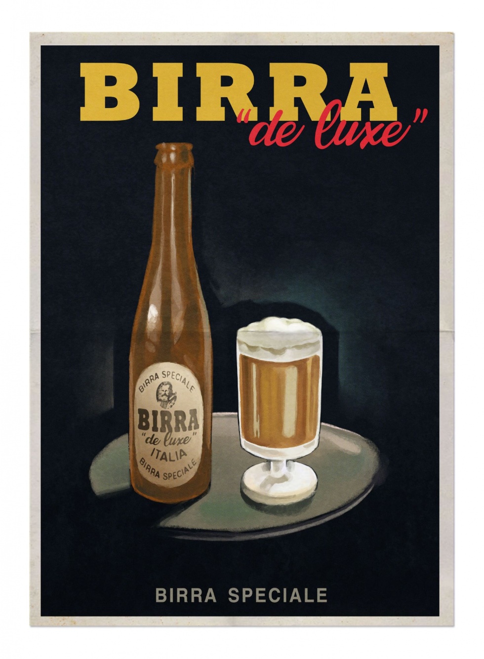
GAVIN: During the prep period for the series it’s an opportunity to generate graphics for things you know you’ll need. So I will be designing useful items first of all, cigarette packets, bottle labels, even car tax discs are good to get going on. My first real prop design however was Endeavour’s postcard to Thursday, from Venice, in the opening of ORACLE (S7:E1). That was a nice thing to kick off with and I had an opportunity to get Shaun to write the message on it too.
DAMIAN: Obviously both Poldark and Endeavour are set in the past, do you think it is more challenging to work on period as opposed to contemporary productions in terms of the research process?
GAVIN: It can be challenging, but there is a wealth of reference for period shows. That can be from books or internet sources. Also visiting museums and libraries are essential. For contemporary shows, research can be somewhat easier because we are surrounded with reference.
DAMIAN: How much time might you spend on research as opposed to actually designing and then physically creating the objects?
GAVIN: At the start of a show there’s more opportunity for research and to source assets, such as gathering suitable paper stock for a period show. When we’re in the thick of shooting there’s more limited time, but it’s good to be prepared. I still like to spend a couple of hours on research before designing the prop.
DAMIAN: I know from my past interviews with people who have worked on Endeavour – for example, production and costume designers – that they often refer to a particular set of books or magazines in their collection which help with the visual aesthetics associated with the ‘60s or ‘70s. Do you have at least one well-thumbed bible that has proved particularly useful during series 7 and 8?
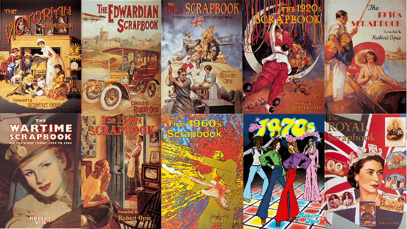
GAVIN: Robert Opie’s decade based scrapbooks are very useful and have been a constant source of reference over the years. The wealth of examples of products and other graphics in them is invaluable. Also being based in Bristol, I’m blessed with being close to ‘Oakham Treasures’ in Portbury. They have a large and varied collection of historical signs, products and advertising held there which is an incredible resource for a graphic designer. It’s somewhere I go to immerse myself before each job.
DAMIAN: Does your work typically begin with discussions with Russ, the producers and directors or do you receive the script first?
GAVIN: I will receive the script, which is then broken down and any graphics that are required are highlighted, be it hero items or what might be needed for dressing in locations. Sometime after that there’ll be a read through in the company of the director, designer, art directors and other art department members. This is when we get to bring up any queries and get a brief from the director on what they would like to see.
DAMIAN: To what extent do you collaborate with other departments such as production design for example?
GAVIN: Alice, who assists me, and I are part of the art department, so we’ll collaborate with all members of the team. I work closely with Madelaine and defer to her vision. We’ll also have a lot of contact with the script editors and also the legal and clearance departments, it’s a collaborative process and there’s a lot of factors. I also may have to work with the costume department if they require any graphics as part of their process.
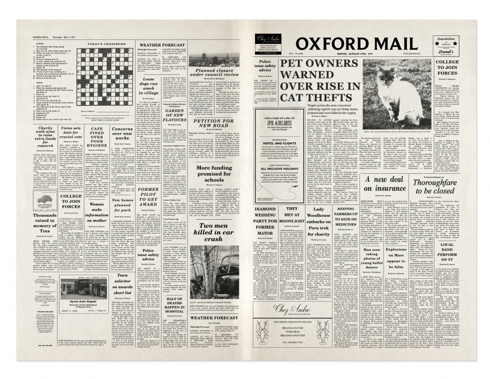
DAMIAN: I’ve always wondered when there is a close-up of a newspaper or magazine article and while the audience only sees it for a few seconds and can’t actually read it all, you still have to produce the complete article. Well, how do you know what to actually write and be sure that the text doesn’t contradict the plot of not only that episode but also possibly past or future storylines?
GAVIN: Here again I’ll work closely with Charlotte and Uju, the script editors, from who I’ll request the copy for the articles in the newspapers. They work with Russ to make sure that any dates and details on graphic props line up with the story and timeline.
DAMIAN: Do you ever slip in names of people only you or other members of the cast and crew would know into such articles or props
GAVIN: I personally don’t tend to do that but that’s certainly happened, names on noticeboards and on forms for example. There is a procedure to follow with using names on the graphics. Everything will have to be checked with the compliance guidelines and there may be issues with names matching real people. So anything created will have to go through the clearance process.
DAMIAN: You mentioned Shaun’s handwriting on the postcard from Venice earlier but who usually writes all the signatures for Endeavour or Thursday on props such as letters or police files?
GAVIN: For recurring characters such as the heroes, we’ll get the actors to sign forms or any handwriting needed, that keeps a consistency through the shows. If the documents are from side characters and they aren’t portrayed as signing them, then it’s easier to do that ourselves.
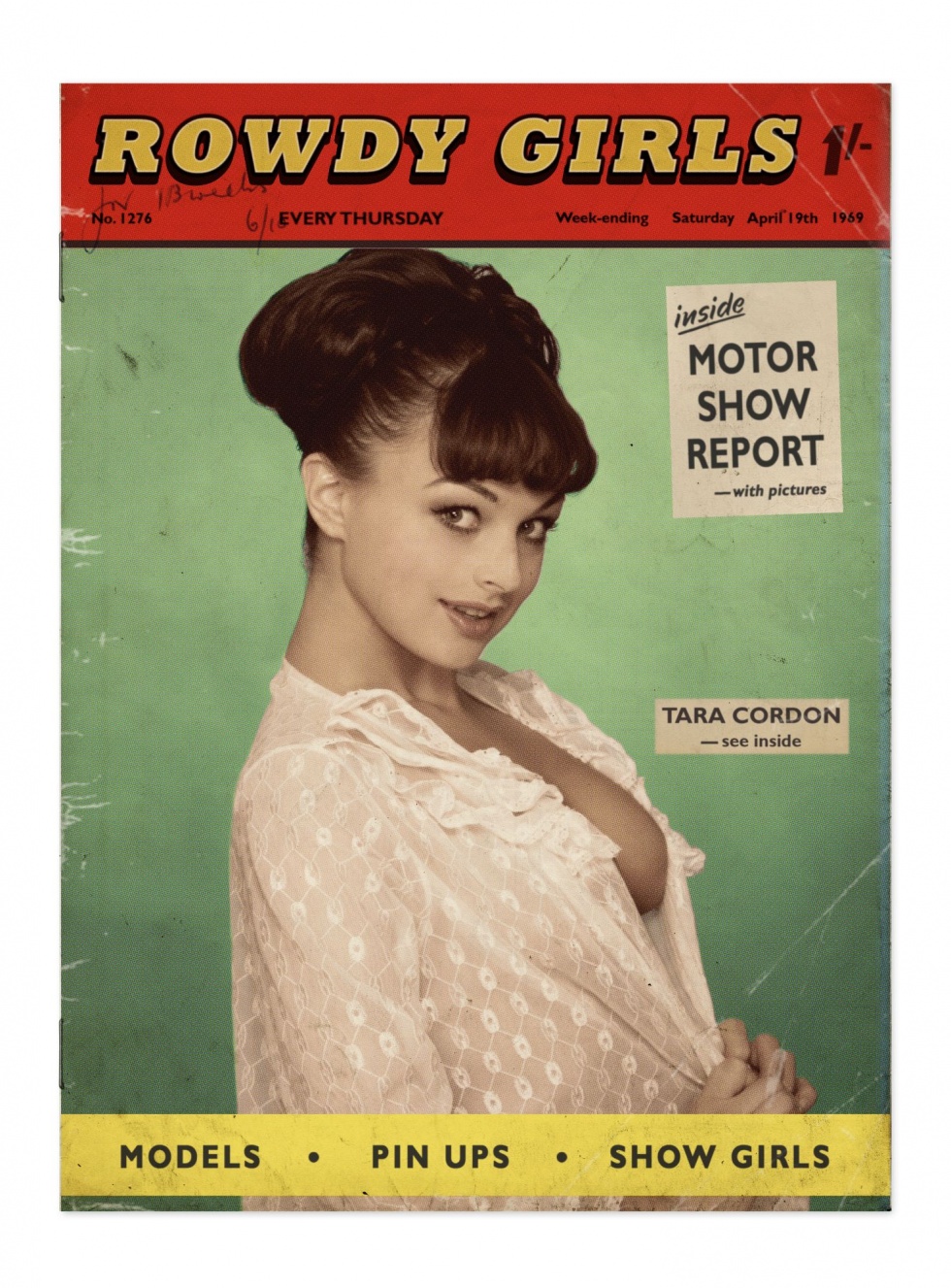
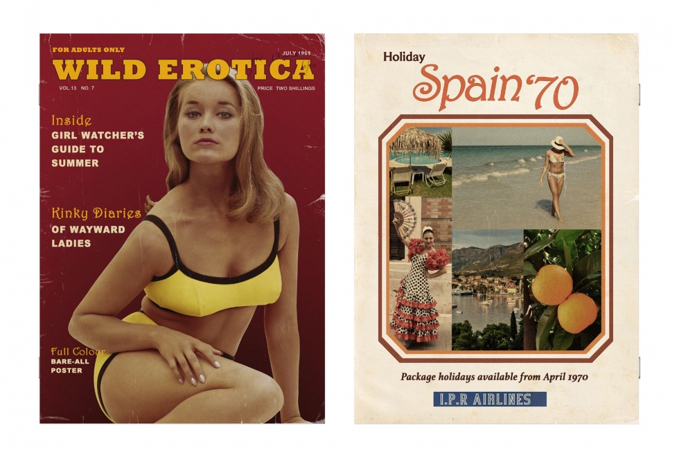
DAMIAN: It’s a tough job but someone’s gotta do it I suppose, was it particularly challenging researching the covers you designed for magazines such as ‘Rowdy Girls’ (ORACLE) and ‘Wild Erotica’ (RAGA)?
GAVIN: Ha, a tough challenge for sure. There’s plenty of reference out there of course, online etc. For ‘Rowdy Girls’ I did pick up a vintage copy of ‘Parade’ for reference into the size and paper stock to create an authentic prop. As with most things there will be a clearance process for the graphics – making sure the magazine names don’t infringe on any copyright for example – and of course the images must comply with Ofcom broadcast regulations regarding the watershed. Stock image sites are useful for getting period images to use. There’s a limit to what’s available and sometimes you can recognise images on other show’s graphics, that I’ve also used myself.
DAMIAN: One of the supporting cover lines on ‘Wild Erotica’ reads “Kinky Diaries of Wayward Ladies”, I’m wondering who came up with this because “wayward” sounds like a word Russ would use?
GAVIN: That would have been me in that particular case. Russ often adds lines like that in the script description, but he is immensely busy and we don’t want to bother him all the time for such things. I’m sure he would have thought of many more of them though.
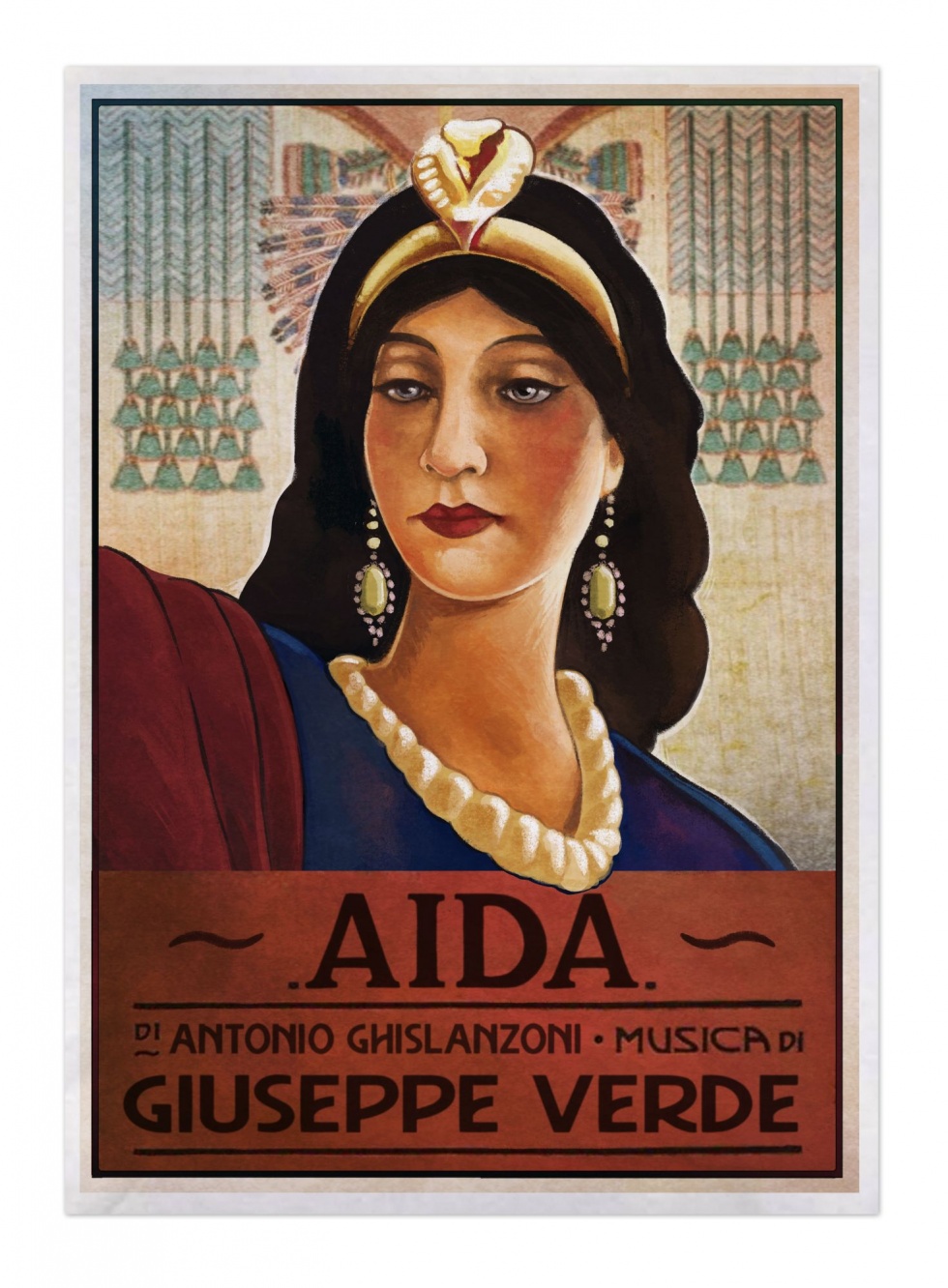
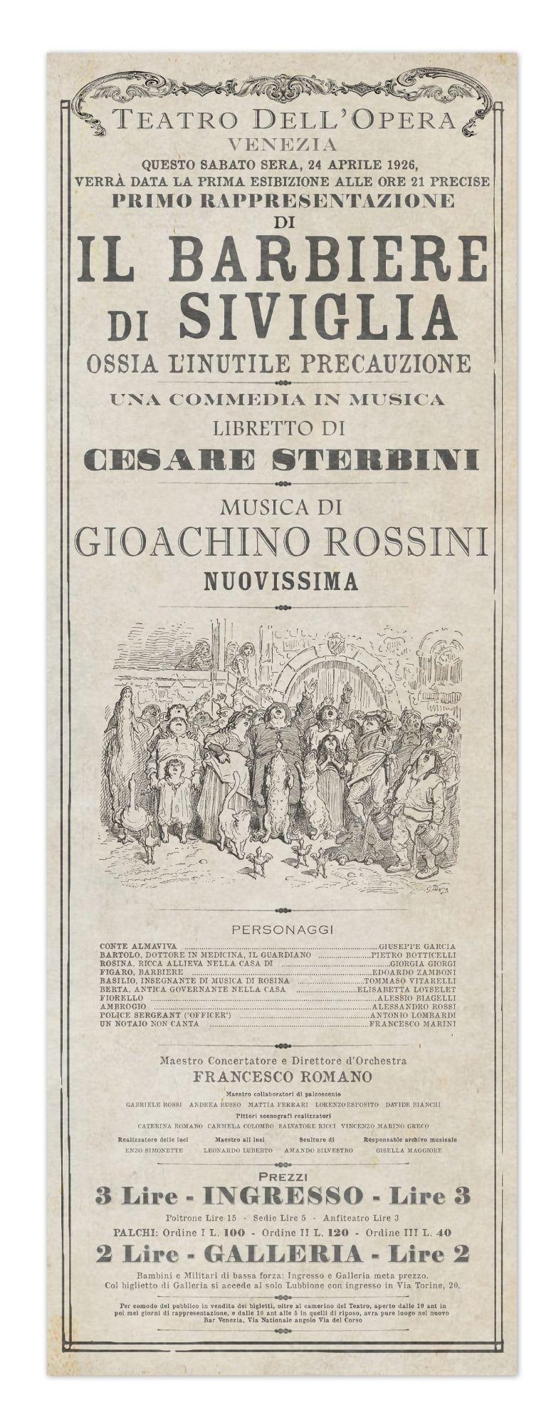
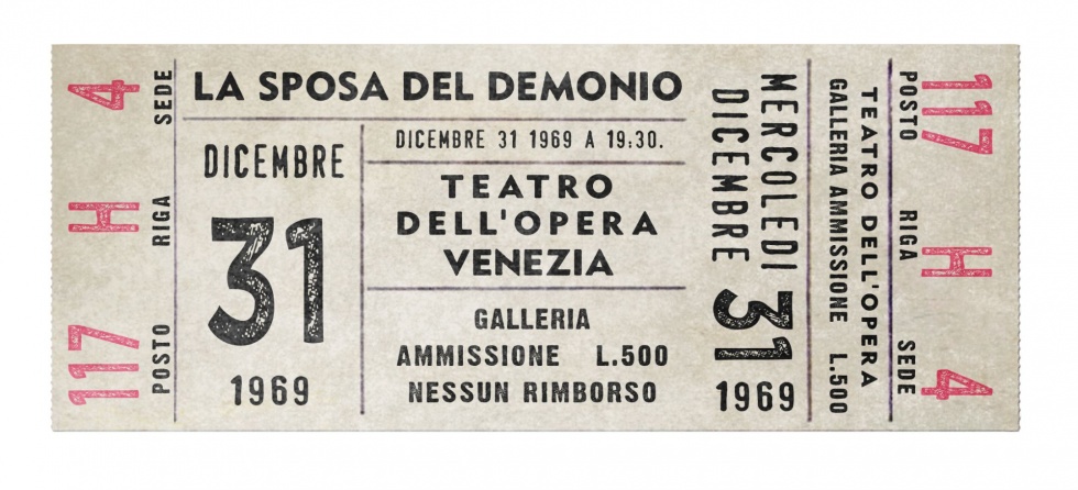
DAMIAN: Well I’m sure Morse, particularly his older incarnation would approve. Anyway, tell me about the creation of ‘The Cure for Love’ opera poster and programme, did you look at old artwork from Venice or just the period more generally associated with baroque?
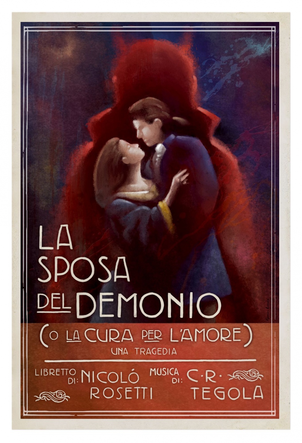
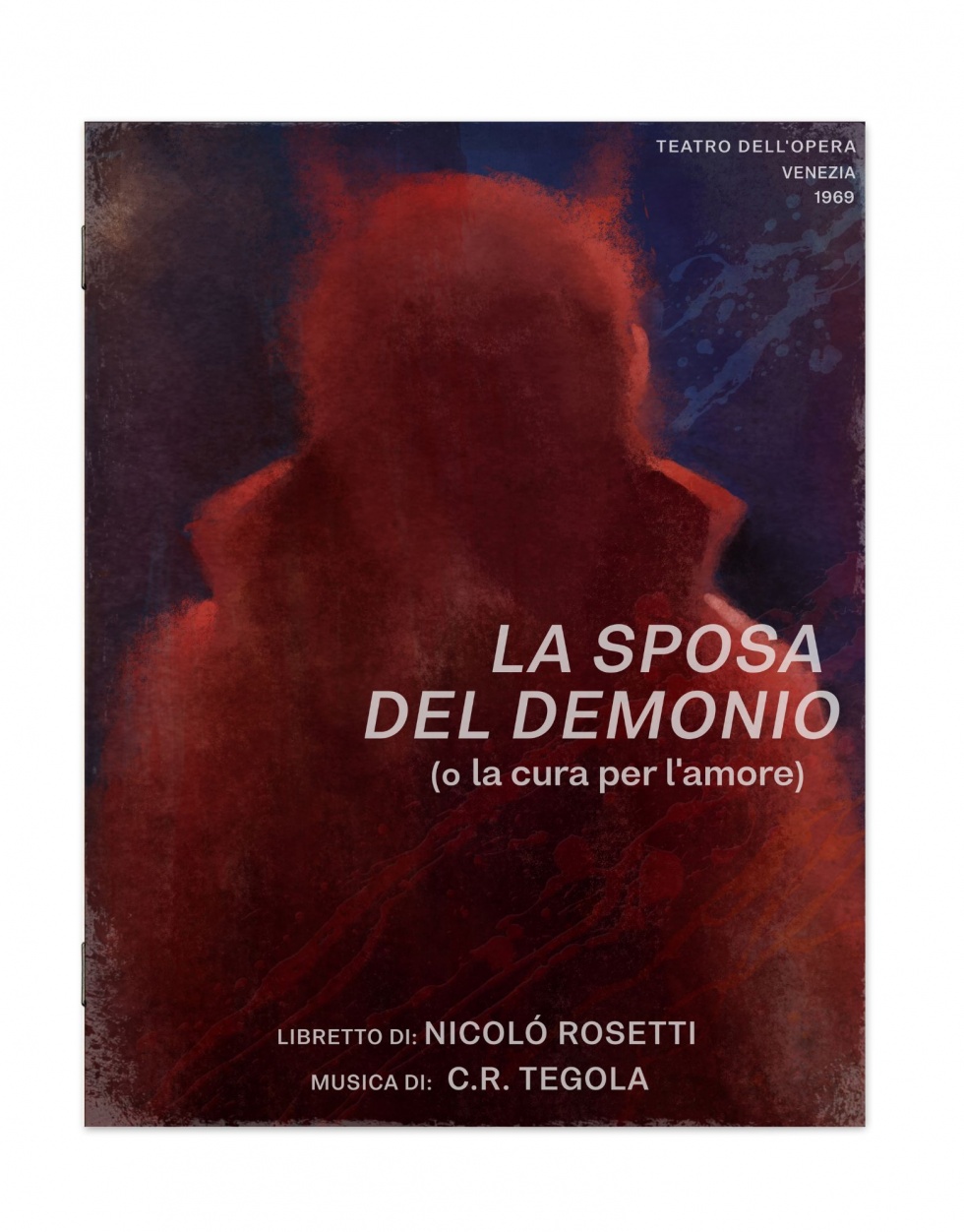
GAVIN: I looked at contemporary opera posters and ephemera for research, having the plot of the opera helped with creating the imagery. The poster image was created digitally, it’s much quicker for me to work in this way, there wasn’t a lot of time to generate the dressing graphics for the opera house and consideration into how detailed it would be seen is a factor when deciding how much time to dedicate on them.
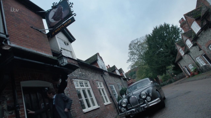
DAMIAN: I know Russ is something of a horror connoisseur, The Wolf’s Head pub sign must be inspired by The Slaughtered Lamb from An American Werewolf in London?
GAVIN: Of course, it was described in detail in the script, so I used the original film’s sign as a start point. Again, I initially illustrated it digitally, this time it was printed full size, mounted onto a board and overpainted for the final piece.

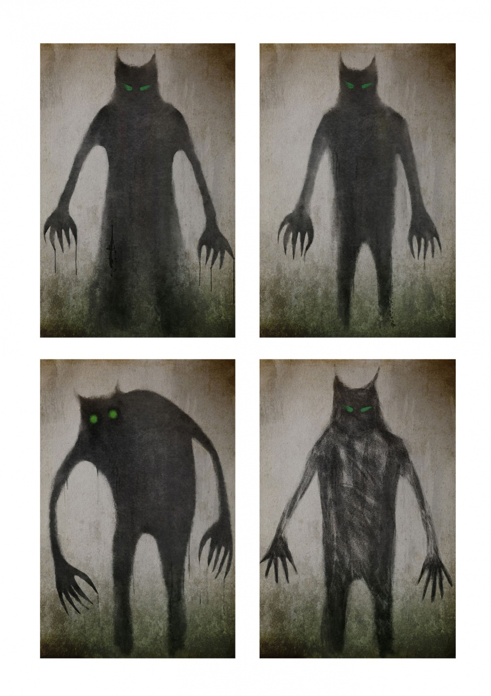
DAMIAN: Tell me about some of the other wolf and horror imagery such as the Jenny paintings, was there a particular mood board that you and the director, Kate Saxon, were working from?
GAVIN: Kate is very visual and had a detailed brief for what she wanted to see. I did a series of illustrations as suggestions for Jenny’s wolf painting, from which she chose preferred options and gave notes, this was then handed over to Ida in the art department who took it on and created the artwork for the set.

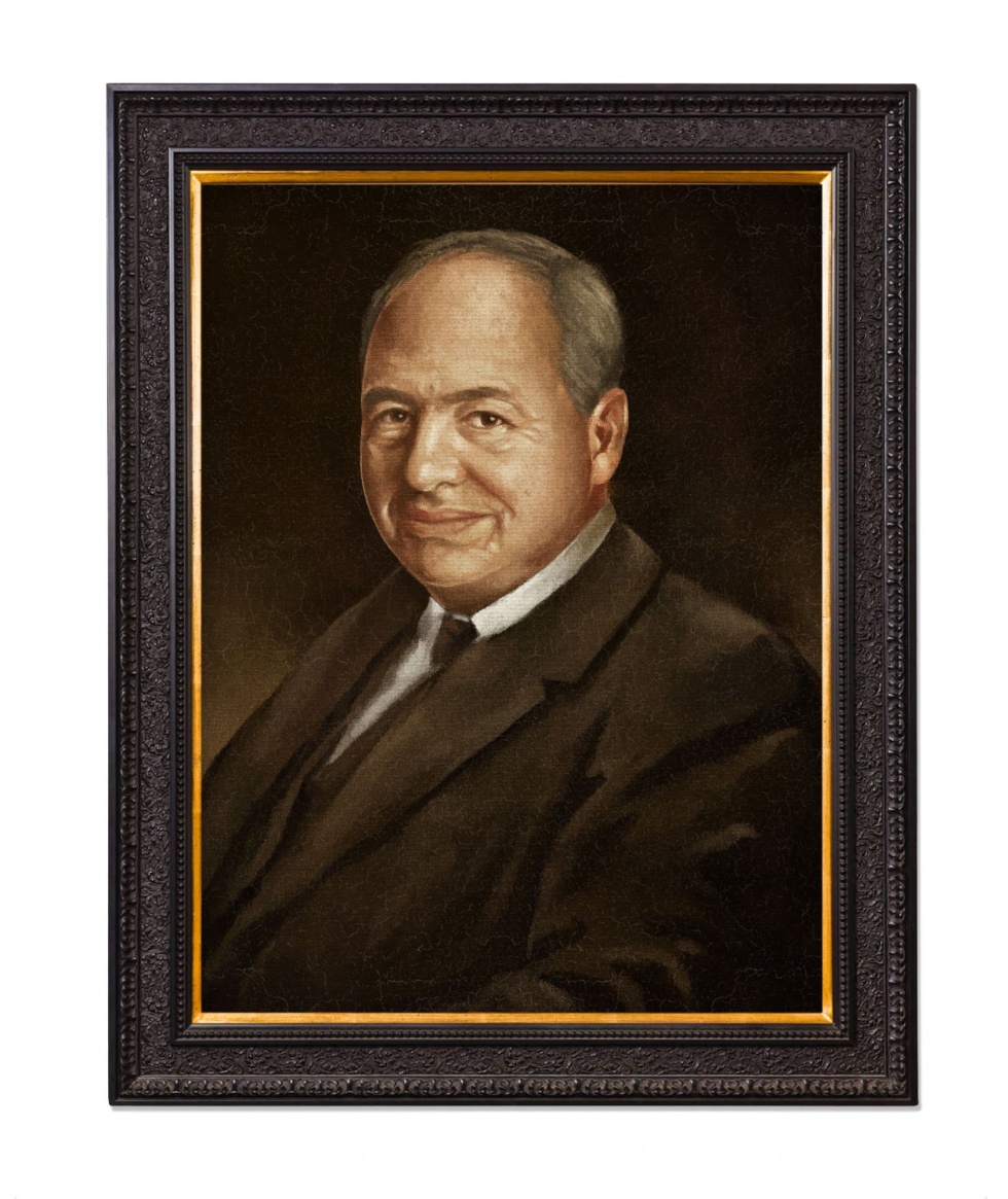
DAMIAN: And what about the beautiful Colin Dexter portrait featured in ZENANA?
GAVIN: Creating portraits is something I always relish doing, so when there was a suggestion for a Colin portrait I was happy to jump at the chance. It was again created digitally and this time printed onto canvas and varnished for the frame.
DAMIAN: What’s the most challenging graphic you created for the latest series of Endeavour?
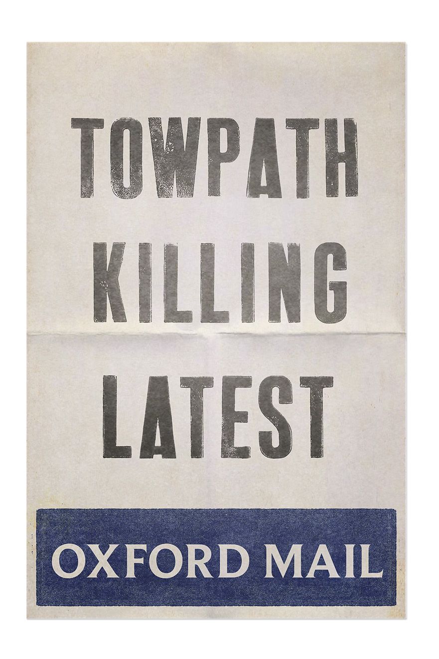
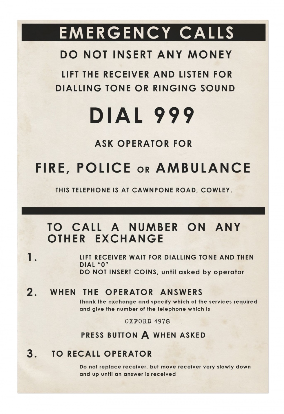
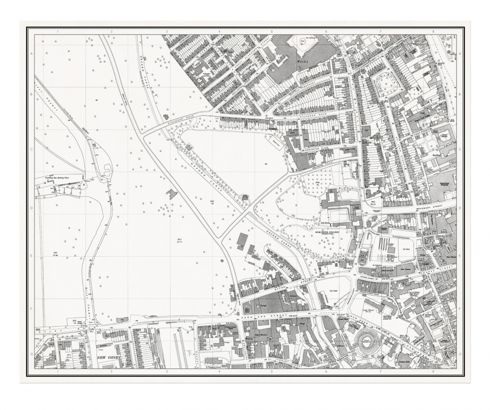
GAVIN: Maps are always challenging and time consuming, especially if they are referring to fictional places. Oxford maps have to be elaborated on and often manipulated to include the scripted details. Another challenge are the newspapers, there are a number of editions of the ‘Oxford Mail’ in each film and all the information we are given is for the hero articles only, but each paper needs to have a complete front and rear cover created, so that’s a lot of additional copy and images to place in the layout, along with period advertising to put on there also, to have them look authentic. This all has to be checked and cleared with compliance so there aren’t any issues with copyright or existing people.
DAMIAN: I’ve actually seen where they keep all the old props from previous episodes and I remember thinking “this belongs in a museum” as Indiana Jones might say. I know you would never do this – and, of course, neither did I – but if you could take just one item home with you when no one was looking, what would it be?
GAVIN: Can I have one of the cars? Definitely the cars, I’d take a car… hypothetically of course…
DAMIAN: You take the car and I’ll take the Calloway LP. Gavin, thank you very much indeed.
GAVIN: Thank you Damian, it’s been a pleasure.
~
More information and images from Gavin Lines can be found on his website: gavinlines.com
Interview copyright © Damian Michael Barcroft 2021